
- Add to bookmarks
-
0BookmarksBookmark added. Bookmark removed.
- Quicklinks
Design grid
The design grid forms the structural basis for the design of websites, apps and other digital media. It’s an invisible system of horizontal and vertical lines that organises content clearly and harmoniously. Using an efficient grid in a targeted way can reduce design complexity and improve page performance, resulting in quicker loading times. A well thought-out grid has a huge impact on how users experience and interact with content. There are also several factors to consider to achieve a good design:
- Usability: Usability The user-friendliness of a website, app or portal. It includes things such as the efficiency, effectiveness, satisfaction, usability, ease of understanding, etc. of a system from the user’s point of view. switch to glossary intuitive navigation and clear structures
- Responsive design: adapting to different devices and screen sizes
- Visual hierarchy: emphasising important elements
- Typography: easy-to-read fonts and clear text structure
- Colours and contrasts: emphasising important elements and ensure good legibility
- Images and multimedia: using images and videos in a targeted way
- White space (negative space): clear, uncluttered layouts with a good amount of white space
- Consistency: standardised appearance and recurring design elements
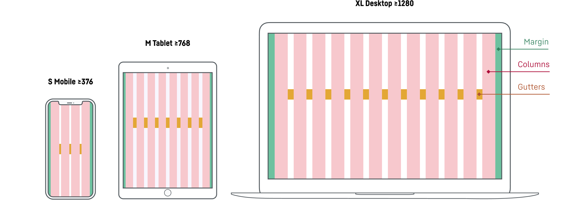
Optimised grids are used for the different breakpoints (mobile, tablet and desktop), see image for example. Please note the ‘mobile first’ rule – the design is first optimised for smaller screens and then adapted to larger screens.
Layout guidelines
All relevant information on the structure of websites and portals, such as spacing, responsive behaviour, etc., can be found in the Pattern Library.
Contact
If you have any further questions, please do not hesitate to contact us. Please use the contact form provided or visit our LHO service desk (only for Liebherr employees).