


- Add to bookmarks
-
0BookmarksBookmark added. Bookmark removed.
- Quicklinks

What are functional colours?
Functional colours are specific colours that are used in different fields, such as design, architecture, traffic, medicine or IT to communicate a particular function or meaning. These colours are not selected for purely aesthetic reasons, but rather for their clear, standardised meaning that conveys a specific message to the user or observer, e.g.:
-
Road signs:
red for stop signs, yellow for caution or warning signs, green for right of way. -
Software and user interfaces:
colours such as blue or green for ‘confirmed’ or ‘completed’ tasks, red for errors or warnings. -
Medical symbols:
green for healthy conditions, red for serious danger or emergencies. -
Occupational health and safety:
red for danger, yellow for warning, green for safe areas.
Our functional colours
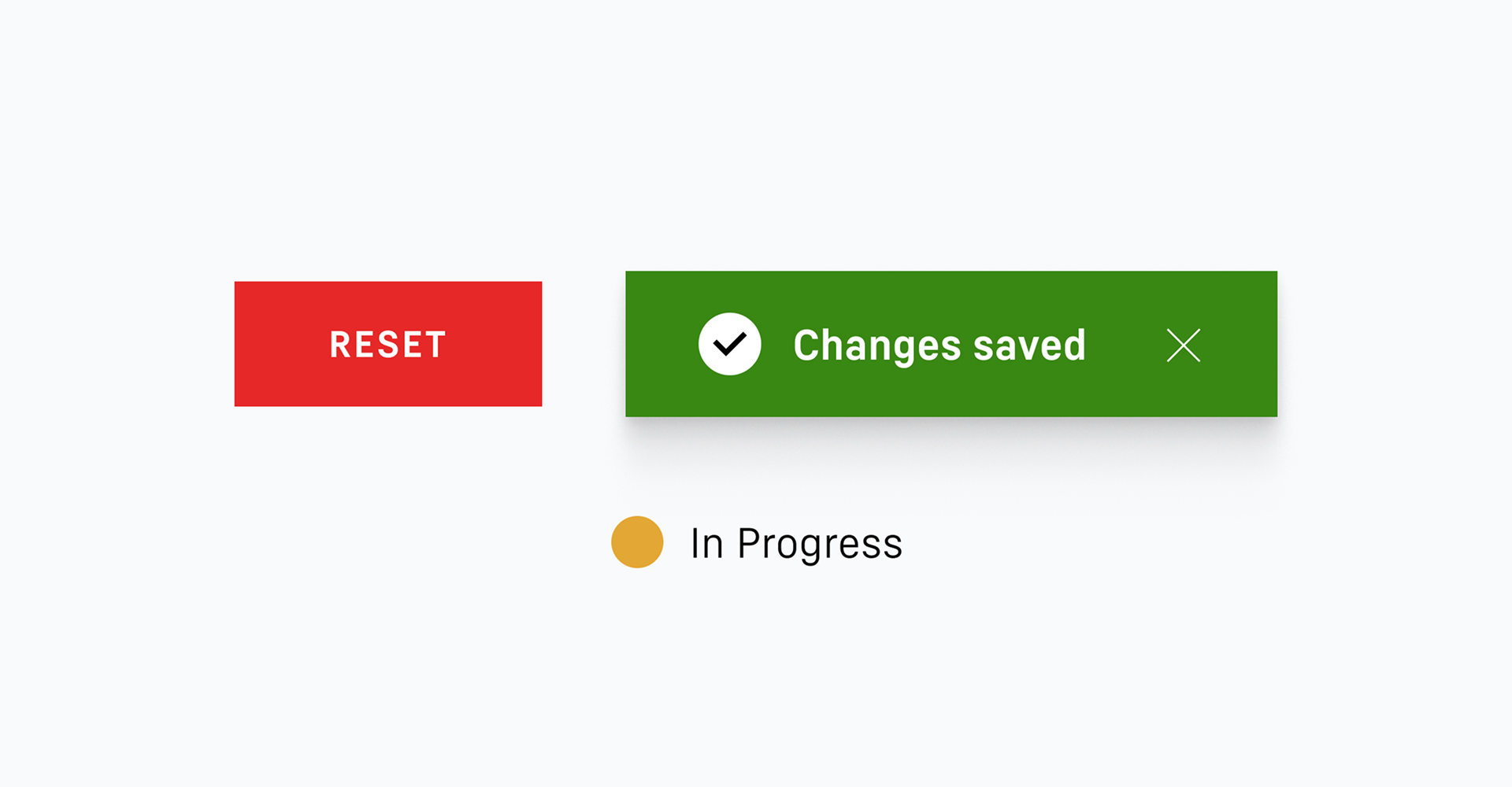
Each of the Liebherr functional colours of ‘Error’, ‘Warning’ and ‘Success’ is available in two versions: a lighter variant and a darker variant.
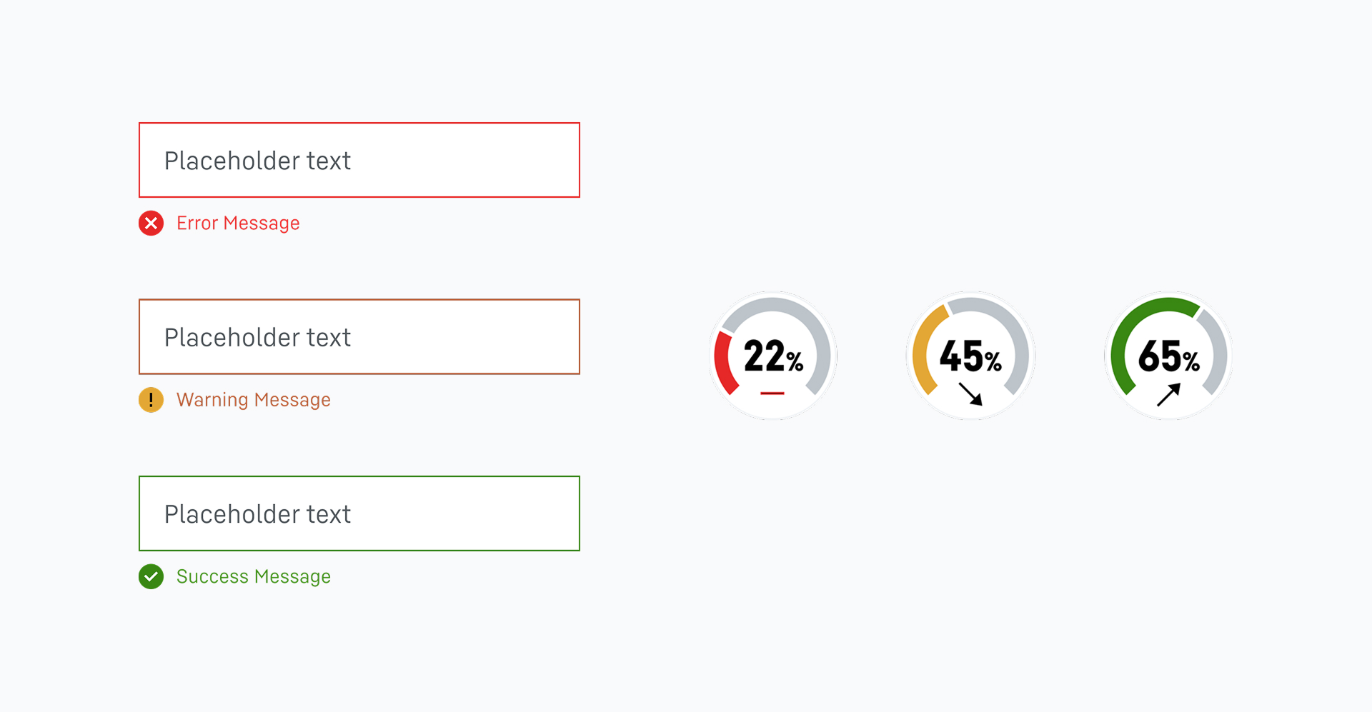
- Functional colour Error: To visualise error messages or critical situations that require the user/observer to act.
- Functional colour Warning: To visualise imminent critical situations or warnings.
- Functional colour Success: To visualise positive responses, such as confirmations or successful actions.
Dos and don’ts
#1
The functional colours are to be used exclusively to visualise system feedback and functions.
#2
System feedback and the visualisation of functions may only be presented using the Liebherr functional colours. Liebherr secondary colours are not to be used for this purpose.
#3
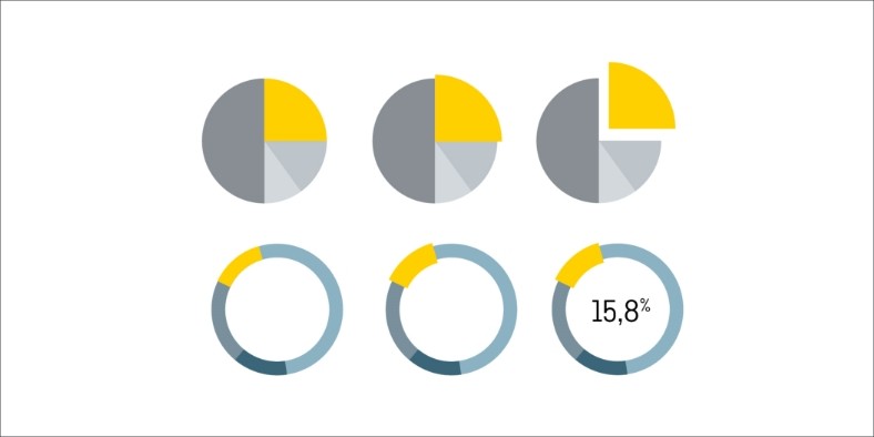
The Liebherr functional colours are used in the user interface to indicate a ‘success’, ‘warning’ or ‘error’. However, system responses, such as those that indicate a fill level, also have to be displayed using the functional colours.
#4
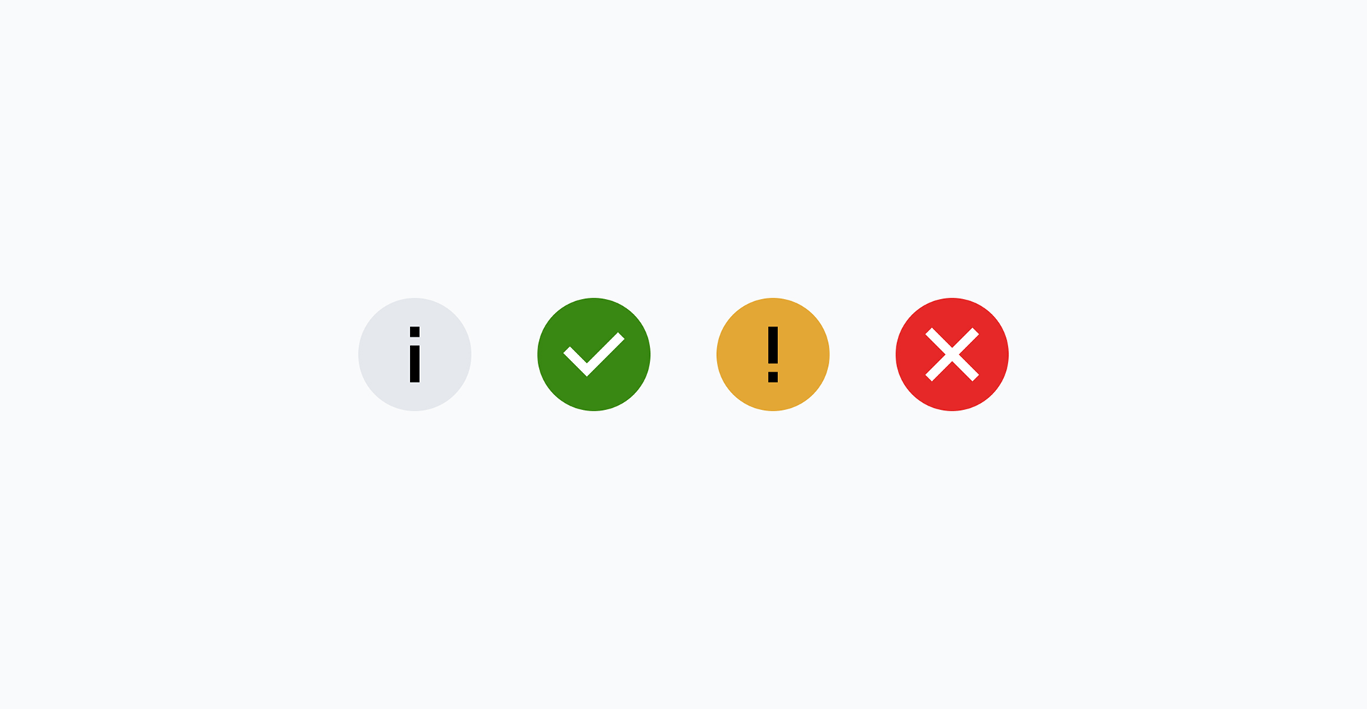
The Liebherr functional icons are symbols that are created specially for the response types of information, success, warning and error. Alongside the neutral information icon, they must only be displayed in the functional colours. They are incorporated in places where the user receives important and specially designated system responses.
They are also permitted to be used for communicating ’dos and don’ts’.
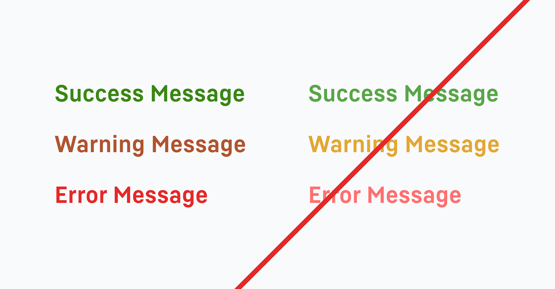
#5
When using functional colours for text in the user interface, this must always be set in the darker of the two colour variants in order to fulfil criterion 1.4.3 of the WCAG (Web Content Accessibility Guidelines) 2.1. This criterion describes the minimum contrast between a text and its background.
Text may only be set in the functional colours for success, warning or error messages.
Use of functional colours
For digital user interfaces, functional colours are an important means of presenting system feedback in a way that is clear and immediately understandable. They help to make interaction with the application intuitive and improve usability.
Developers and designers have to ensure that these colours are clearly recognisable on all devices and screen sizes.
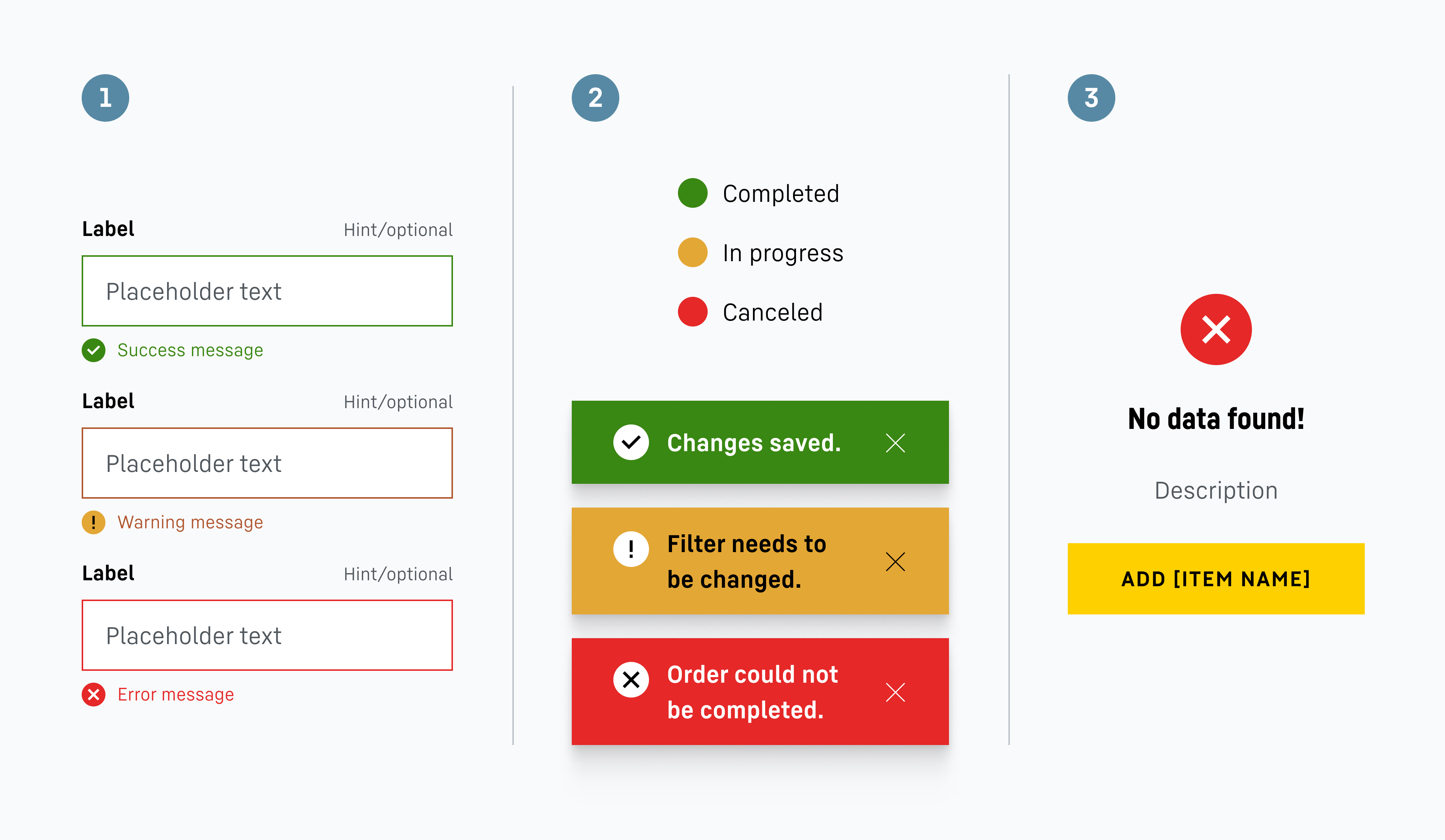
1 In forms or other interaction processes, the Liebherr functional colours are used to visualise the response types of success, warning and error. This careful visual response prevents misunderstandings and leads to a faster rectification of errors or to an understanding of a problem that does not necessarily require immediate action but is helpful for the subsequent interaction process.
2 The Liebherr functional colours are used for status displays and pop-up messages to quickly and visually convey to the user how an action was performed. This colour coding should be applied consistently to ensure clear communication.
3 Functional colours are used on the functional icons. These often form part of a system feedback that gives the user an insight into whether, for instance, an action is necessary.
Downloads
Brand colours table
Overview of Liebherr colour values (PDF, 67 KB)
Colour palettes InDesign
Liebherr colour pallets (ZIP, 3 KB)
Functional icons
Functional icons (ZIP, 46 KB)
Contact
If you have any further questions, please do not hesitate to contact us. To get in touch, please use the contact form provided or visit our LHO service desk (only for Liebherr employees).