
- Add to bookmarks
-
0BookmarksBookmark added. Bookmark removed.
- Quicklinks
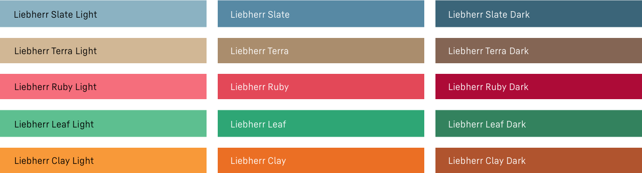
Our secondary colours
The Liebherr secondary colours Slate, Terra, Clay, Leaf and Ruby complete our colour palette and expand our design scope when using colour.
Everything important at a glance
#1
They are always used thematically or for specific applications.
#2
A maximum of three different secondary colours can be combined for each application.
#3
If multiple secondary colour shades are used in one medium (brochure/online), they must be colour-coordinated with each other.
#4
The Secondary colours Slate und Terra can be used for backgrounds and large areas in general.
#5
Clay, Leaf and Ruby are used as accent colours or for specific applications.
#6
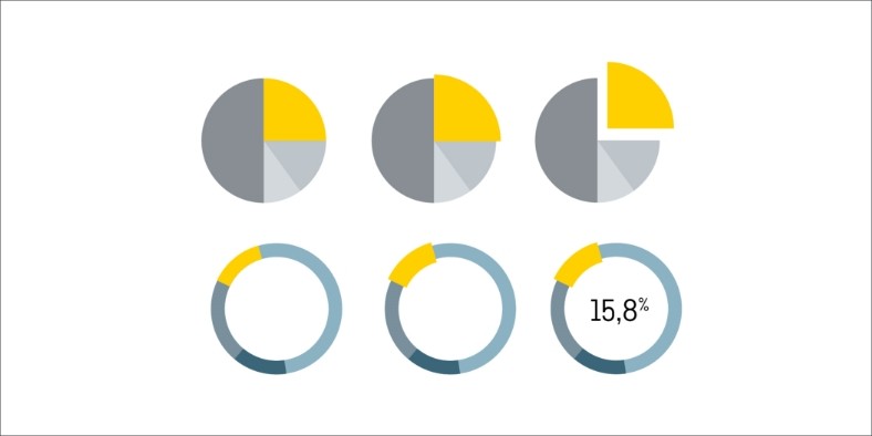
when using a secondary colour as a background colour, the text colour must be selected as shown in the illustration below.
Representation in physical space
The secondary colours take on further important functions for the representation in physical space:
- In physical space, we use secondary colours to strengthen the room atmosphere.
- Especially in areas where people stay for a longer period of time, they can be used to set emotional accents.
- We intentionally use secondary colours for materials that are not permanently installed so that their colours can be changed with minimal effort if need be.
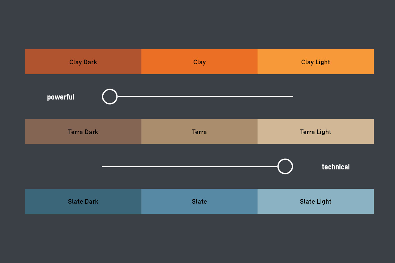
- The colours Liebherr Slate and Liebherr Clay are used to nuance the powerful and technical communication. Care should be taken to use Liebherr Clay judiciously due to its impact. Liebherr Terra supports Liebherr Clay and Liebherr Slate as well as the nuance-independent corporate group communication.
Downloads
Brand colours table
Overview of Liebherr colour values (PDF, 67 KB)
Colour palettes InDesign
Liebherr colour pallet (ZIP, 3 KB)
Contact
If you have any open questions please use the contact form available at the following link or visit our LHO Service Desk (only for Liebherr employees).