
- Add to bookmarks
-
0BookmarksBookmark added. Bookmark removed.
- Quicklinks
Our primary colours
The Liebherr primary colours shape the look of our brand at all contact points. They are used for the logo, typography, design elements and interfaces, for example.

Liebherr White is the preferred background colour.
Liebherr Black is primarily used for typography and graphic elements.
As the defining brand colour, Liebherr Yellow is used in a targeted way and is always linked to a function.
Liebherr Yellow
The brand colour Liebherr Yellow provides the key accent across all media to aid identification of our brand. It makes Liebherr clearly recognisable even when used sparingly.
Liebherr Yellow is always used in conjunction with a specific function. For example, we use Liebherr Yellow across all media to identify the sender ( Brand banner ), to highlight a related link (call to action) online or in presentations as well as in physical space to address customers directly.
In every case, Liebherr Yellow conveys functional information and is never used as a purely decorative element.
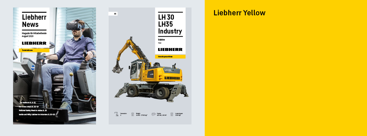
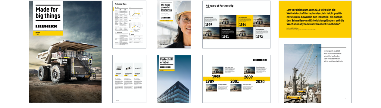
Liebherr Yellow in use
Literature
In areas that are on show, such as title pages of print media, Liebherr Yellow is used to describe the division and identify the brand. On inside pages, it is used to highlight content.
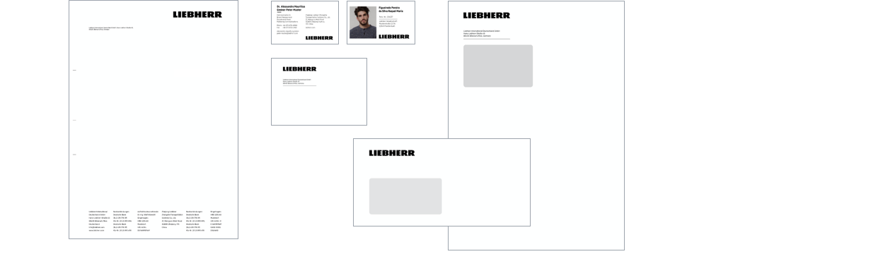
Office
Divisions do not need to be identified with colour on business stationary; decorative elements are not used. PowerPoint presentations follow the rules for literature.
Content
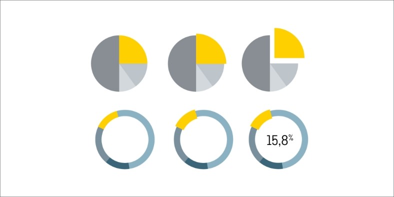
Liebherr Yellow is used for accentuation in charts, infographics and illustrations.
Online domain
In the online domain, Liebherr Yellow is used for brand and division identification, to highlight relevant content (call to action elements) and to guide users.
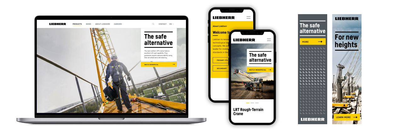
Content
Liebherr Yellow is used for accentuation in charts, infographics and illustrations.
Usage in physical space
In physical space we use Liebherr Yellow as a functional accentuation
- to guide the way
- to mark highlight and interaction areas
- for section identification
- to address customers directly
When using Liebherr Yellow, we also take into account the colour scheme of the machines and ensure a balanced colour ratio.
The large-scale combination of Liebherr Yellow and Liebherr Black is generally excluded.
Content
Liebherr Yellow is used for accentuation in charts, infographics and illustrations.
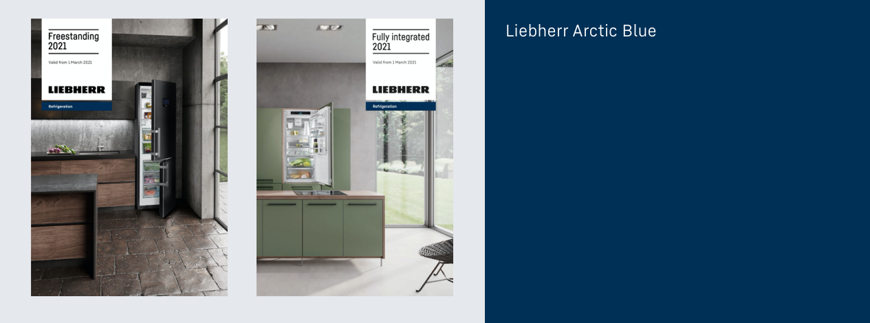
Liebherr Arctic Blue
A separate colour palette has been developed for Liebherr Domestic Appliances, which applies only for this division. The most important difference is that Liebherr Arctic Blue is used as the primary brand colour instead of Liebherr Yellow. There are also other secondary colours that are specific to Domestic Appliances.
Good to know
The Domestic Appliances division only communicates in blue when it is identifiable as the sender. Content developed by Domestic Appliances that is used as cross-divisional communication and names the Group as the sender is still designed with Liebherr Yellow.
Downloads
Brand colours table
Overview of Liebherr colour values (PDF, 67 KB)
Colour palettes InDesign
Liebherr colour pallet (ZIP, 3 KB)
Contact
If you have any open questions please use the contact form available at the following link or visit our LHO Service Desk (only for Liebherr employees).